Community Contexts
Overlays
LOCATION: Data Sources & Map Variables
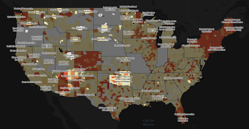
Overlays in the Covid Atlas allow you to identify COVID-related trends in uniquely vulnerable locales. Use the map variables panel (left sidebar) to select the data source/variable that you would like to map and toggle between community types under Overlays. Choose between overlaying Hypersegregated Cities, Native American Reservation, Black Belt Counties, and US Congressional Districts to highlight communities/regions of interest.
After selecting an overlay, you can visualize COVID or community data with the natural breaks binning, box map binning schemas, hotspot analysis, and any other tools that are available within the Atlas.
METHODS:
The Overlays options were curated from partnerships with US Covid Atlas users and communities. These geographies and communities also represent groups that have been historically underrepresented in public health data reporting and analysis.
- Hypersegregated Cities comes from research led by sociology and public affairs professor Douglas Massey of Princeton University's Office of Population Research.
- Native American Reservations comes from the US Census Bureau, Department of Commerce 2017 TIGER/Line American Indian/Alaskan Native/Native Hawaiin (AIANNH) National Shapefile.
- The U.S. Black Belt refers to a social and demographic history of approximately 200 southern US counties that were at least 30% Black or African American as of the 2000 Census. These counties have a history of majority African American population and cotton production.
Resources
LOCATION: Data Sources & Map Variables
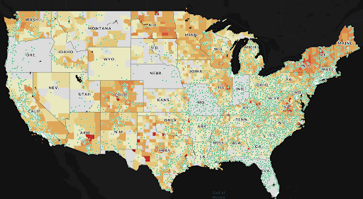
The Altas allows you to plot resources to visualize the distribution of COVID-related public health resources throughout the country. Use the map variables panel (left sidebar) to select the data source/variable that you would like to map and toggle between resource types under Resources. Choose between plotting Federal Vaccination Sites, Hospitals, Clinics, or both Clinics and Hospitals.
After selecting a resource to plot, create map visualizations with the natural breaks binning, box map binning schemas, hotspot analysis, and any other tools available within the Atlas.
Community Context Panel
LOCATION: Community Data
Gain insight into COVID-related trends by clicking on a county or state (or hold control and click to select multiple counties or states) by exploring the Community Context Panel on the right side of your map. Scroll through the panel for information on the selected county or state population, case rates, health and other community data.
The following is a selection of data provided for each county (see Chapter 1: Gaining Insights on Communities for more details):
- Population
- Total COVID-19 Cases
- Total COVID-19 Deaths
- 7-Day Daily Average of New Cases (per 100k Population)
- 7-Day Average New Deaths (per 100k Population)
- COVID-19 Vaccination Rates
- Testing Positivity Rates
- Community Health Factors (Source: County Health Rankings, 2021)
- Essential Workers (Source: American Community Survey, 2019)
- Community Health Contexts (Source: County Health Rankings, 2021)
- Length & Quality of Life (Source: County Health Rankings, 2021)
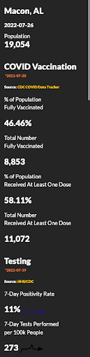
By default, the Community Context Panel will show County-specific information for today's date. Adjust the date for which stats are displayed by specifying a date of interest using the Time Slider or Calendar.