Methodology
The Atlas incorporates multiple visual analytic methods to explore data across space and time, as well as spatial statistical products to measure spatial clusters and outliers. This section highlights analytic methods used on the US Covid Atlas Dashboard, tying content posted in early days of the Pandemic, as well as from our work published in Transactions of GIS.
For a more complete view of the data, methods, and technological framework developed for the Atlas, be sure to read through the Learn Toolkit, Data, Research, and Tech pages on this site.
Educators: In Spatial Literacy in Public Health, a text by the American Library Association of faculty-librarian teaching collaborations, the chapter "Visualizing Public Health Data: Using the U.S. Covid Atlas and GeoDa for Spatial Insights" by Cecilia Smith (University of Chicago) and Marynia Kolak (UIUC, Atlas PI) details multiple analytic methods covered below, and provides teaching strategies and additional resources.
Spatial Scale
When the Pandemic first emerged in early 2020, county-level visualizations were rare but when viewed, show a dramatically more nuanced and detailed pandemic landscape. The US Covid Atlas was the first dashboard to visualize data at both state and county-scale as total cases, deaths, and population-weighted rates to provide a richer understanding of the pandemic. Case information can be explored by clicking on county or state areas to generate pop-up windows, or to change graphs of confirmed cases.
Tutorials to learn how to explore spatial scale:
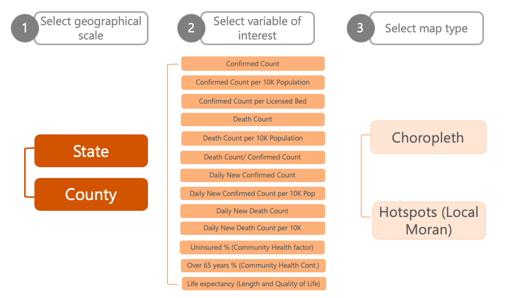
Steps required to display each map available in an earlier version of the Atlas. Today, there are additional options for viewing (ex. 2D and 3D styles). By: Karina Ordonez
Time Scale
The thematic maps on the Atlas are interactive and quickly provide access to multiple sources of COVID-19 data over time for historical exploration using a time slider tool. A temporal slider allows the current view to be updated over time, providing users the ability to watch the pandemic emerge over time.
In addition, you'll find data available at different time scales, including:
- Cumulative: Total number of instances, such as confirmed cases, deaths, or vaccines, since the start of the pandemic or the start of data collected.
- Daily New: The number of new instances per day for which data is available.
- 7-Day Average: The average number of instances over the previous 7-day period for which data is available.
- Custom Range: Use the Time Slider and Calendar to choose a custom date range; i.e. the last month, 6 months, the latest variant, etc.
For example, applying the natural breaks with fixed bins on accumulative confirmed COVID-19 cases displays how the disease has spread over time since the very beginning: from just a few counties in March 2020 to almost the entire country by June. Alternatively, visualizing the temporal change based on the daily new confirmed cases (or 7-day average) helps detect areas with emerging cases. Interactive, explorative temporal detection like this allows us to capture not only the base rate, but also the changes that are both critical to tracking areas of concern.
Tutorials to learn how to explore temporal scale:
Dynamic Exploration
In addition to spatiotemporal exploration possibilities, individual counties or states are also interactive. An information window is enabled on hover, providing details on the location (i.e., state name or county name) and basic COVID-19 case and death data. Upon clicking, a county-specific data dashboard opens (on the right-hand side) with detailed health indicators and community risk factors. Data are updated by clicking on a new county. A graph showing new cases and smoothed trends for the selected county is updated on the left-hand side accordingly.
Tutorials to learn how to explore temporal scale:
Thematic Mapping
MAPPING STYLES
The Atlas provides three thematic mapping options:
- Choropleth Maps: uniformly colors each area (e.g., county) according to the represented value.
- Cartogram: scales the size of an each area proportionally to the represented value.
- Dot Density Map: places dots within an area in proportion to the represented value, to preserve the distribution and variation of density of a phenomenon.
Choropleth maps are most commonly used for geovisualization, a thematic map style that represents data through various shading patterns on predetermined geographic areas (e.g., counties, states). Default examples will often use choropleth mapping. Cartograms resize places according to the value represented. We recommend using this technique for states, rather than smaller units like counties, to help with interpretation. Dot density maps can be useful to see the population distribution below county level on the Atlas. We used this approach in an "Assessment of Structural Barriers and Racial Group Disparities of COVID-19 Mortality With Spatial Analysis," published in Jama Network Open (see figure below).
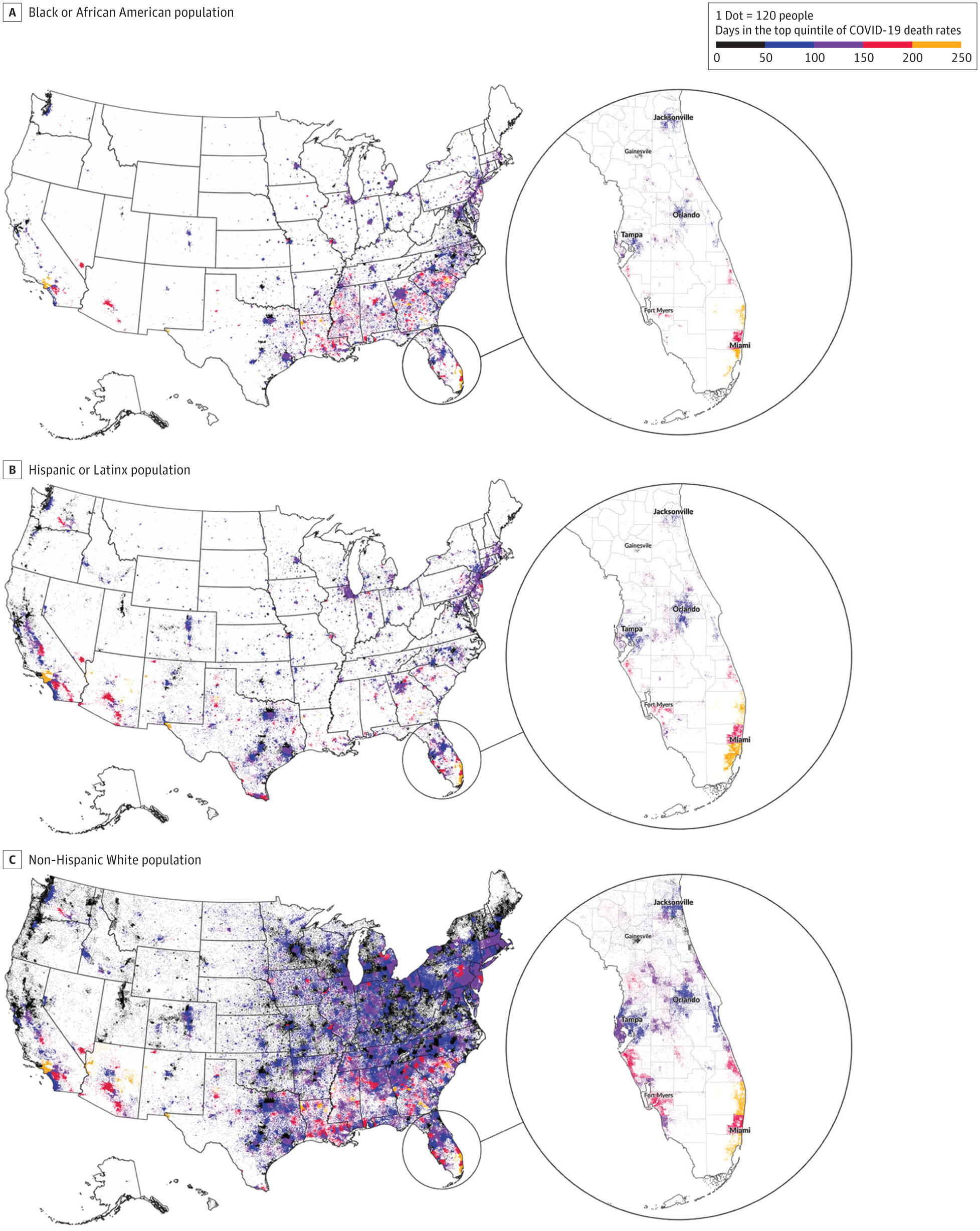
Dot Density Visualization of County-Level COVID-19 Deaths by American Community Survey (ACS) Race and Ethnicity. By: Lin et al, 2022.
DATA CLASSIFICATION: NATURAL BREAKS
For geo-visualization, we adopt jenks natural breaks maps to classify the values of the pandemic data for each state/county. A natural breaks map uses a nonlinear algorithm to create groups where within-group homogeneity is maximized, grouping and highlighting extreme observations.
The Jenks break is a method designed by Jenks (1967). The method assigns each observation to the best classification it could belong to. It aims to find the best possible arrangement of the geographical units into classes, such that the deviation from the mean within classes is minimized, while the differences between classes in maximized. In other words, it aims to group more alike geographical units, while trying to maximize the differences between the groups created.
For illustration purposes only, assume that we want to classify three counties based on its number of COVID-19 cases into two groups. The Jenks strategy works as follows:
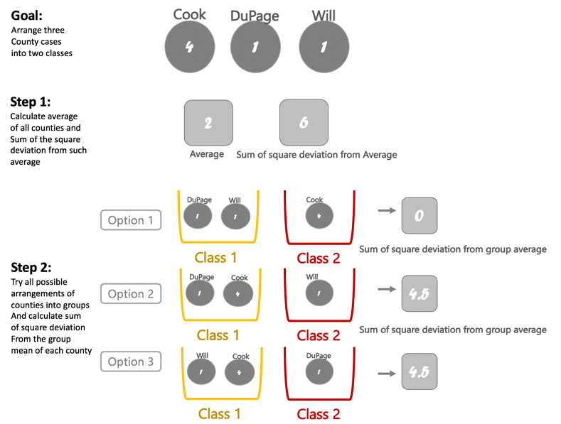
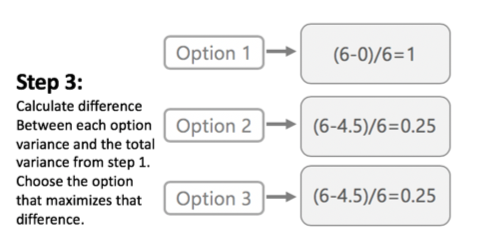
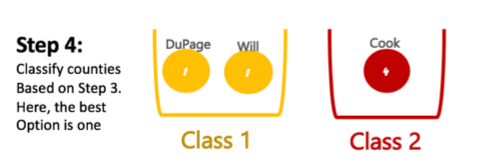
Illustration of Jenks classification process. By: Karina Ordonez
DATA CLASSIFICATION: BOX MAPS
Selecting Box Map will plot the selected variable by categorizing data into bins according to where it would lie on a box plot chart (25th, 50th, 75th percentile, etc.) This is useful for identifying outlier data -- data that is significantly different from the rest, i.e. counties with much higher or lower rates compared to all other counties.
This is the mapped version of a traditional box plot.
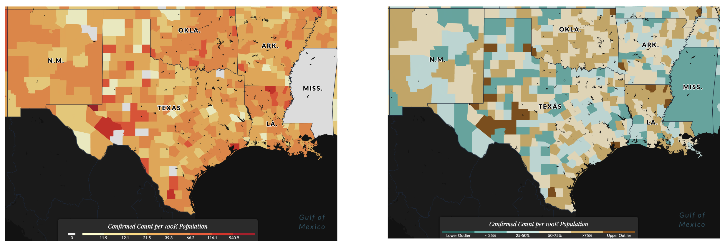
On the left, a map of confirmed cases per 100,000 persons using a Jenks classification. On the right, a Box Map.
Resources to learn how to use thematic maps:
- US Covid Atlas Create a Thematic Map Tutorial
- UCGIS Book of Knowledge: Common Thematic Map Types
Spatial Statistics
HOT SPOT ANALYSIS: LISA STATISTIC
Statistical spatial cluster identification based on local indicators of spatial association (Anselin, 1995), known as the LISA Statistic, is implemented on case and death variables. The clustering technique allows users to identify groups of contiguous counties that are statistically similar based on the COVID-19 indicator (accumulative COVID-19 cases, daily new cases, etc.).
To interpret LISA statistics, consider the following:
- High-High: These red spatial clusters show an area with high numbers/rates, and are surrounded by areas with high numbers/rates.
- Low-Low: These blue spatial clusters show show an area with low numbers/rates, and are surrounded by areas with low numbers/rates.
- High-Low: These light red spatial outliers show an area with high numbers/rates, and are surrounded by areas with low numbers/rates.
- Low-High: These light blue spatial outliers show an area with low numbers/rates, and are surrounded by areas with high numbers/rates.
The “high-high” cluster, for example, can be of particular interest as it allows identification of a group of areas (i.e., counties, or states, in Atlas) where not only their own COVID-19 indicators are high but also they are surrounded by neighboring areas where the COVID-19 indicators are high.
Technical Specifications: We use a first-order queen contiguity weight and one CPU core2 to estimate the local Moran's I, with 999 Monte Carlo permutations and a 0.05 threshold for statistical significance. However, using GeoDa,3 others can replicate these results or employ different hyperparameters, such as different spatial weights to measure geographical similarity, different randomization options (e.g., number of Monte Carlo permutations and specific seeds), or different thresholds for statistical significance.
For more resources on LISA statistics and how to use them in the US Covid Atlas:
- GeoDa Glossary & Chapter on Local Spatial Autocorrelation
- Anselin, Luc. 1995. “Local Indicators of Spatial Association — LISA.”Geographical Analysis G 27: 93–115
- US Covid Atlas Hot Spot Map tutorial
HOT SPOT BEST PRACTICES
The Atlas team recommends identifying hot spots two ways: using the total number of confirmed cases and by adjusting for population. Because of the infectious nature of COVID, high numbers of cases anywhere will be of concern. At the same time, identifying areas that have a disproportionately high number of cases within the population is needed to locate areas hit hardest by the pandemic.
The team further differentiates hot spot clusters and outliers: clusters are counties that have a high number of cases, and are surrounded by counties with a high number of cases. Outliers are areas that have a high number of cases within the county and fewer cases in neighboring counties, highlighting an emerging risk or priority for containment.
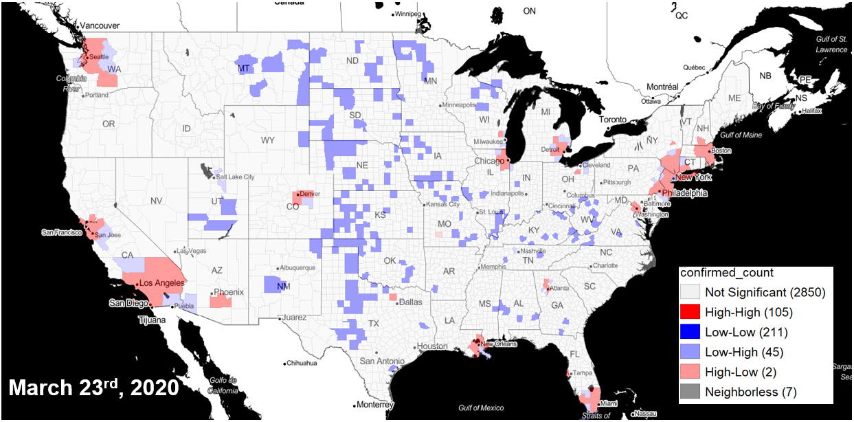
County cluster hot spots(red) using confirmed cases of COVID-19
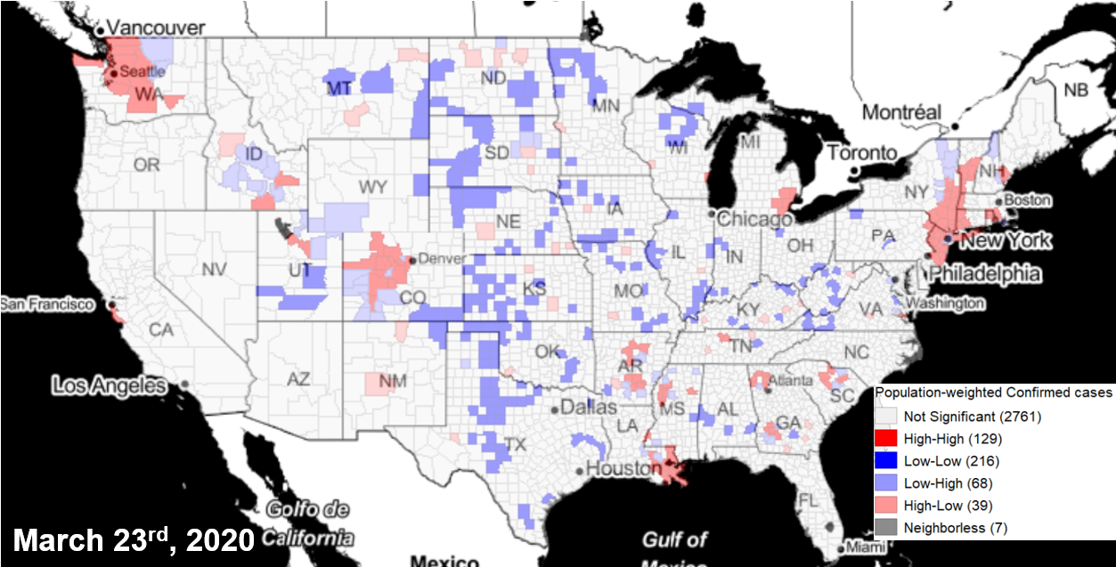
County cluster hot spots(red) using population-weighted adjustment of COVID-19 cases
Limitations
There are multiple limitations in the analytic approach of the Atlas, though we attempt to minimize them.
- LISA cluster analyses rely on computational inference which can generate sensitive results. Depending on the mechanism of disease spread (e.g., outbreaks in a small concentrated population versus slow community spread) and how the testing resources are utilized, the new case count time series can be clumped at times or suffer from seasonality. In such instances, LISA clusters can vary from one day to another. To alleviate this, we added the 7-day moving average of new cases, but these patterns could persist in the data and impact the calculation of LISA clusters.
- While our dashboard provides a nuanced view of how the spatial patterns change over time and across the USA, it provides limited information with what could be the potential drivers, such as state-level policy and local mobility, and whether the pandemic is affecting certain groups of population disproportionately.
- An effective and rapid policy response is highly dependent on having a good understanding of the underlying transmission mechanisms and vulnerable populations. Including fine-resolution, sub-county non-pharmaceutical policies, social mobility, hospitalization, and infection rates by race and ethnicity, would improve the policy response and adaptation in future Pandemics. The true spatial scale of the COVID-19 pandemic is arguably at an even finer resolution than county level, but the data below the county-level resolution currently remains unavailable for the entire country.
In the early stages of the pandemic, individual variables were thought to better capture the different phenomena that were considered important and interesting to the widest range of users that we worked with. As the pandemic shifted towards recovery and equilibrium, multiple composite indices have emerged to be tailored to unique features of the pandemic directly.