Create a Thematic Map
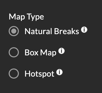
The Map Type buttons in the Atlas’ map variables panel allow you to change how the map is colored and how the data is visualized. This type of map is called a thematic or choropleth map. Each type of map will give you a new of the data.
Choose between visualizing your variable of interest as a Natural Breaks Map (below, left figure) or Box Map (below, right figure).
We select these options as the best method of viewing the distribution of data overall at any given time period.
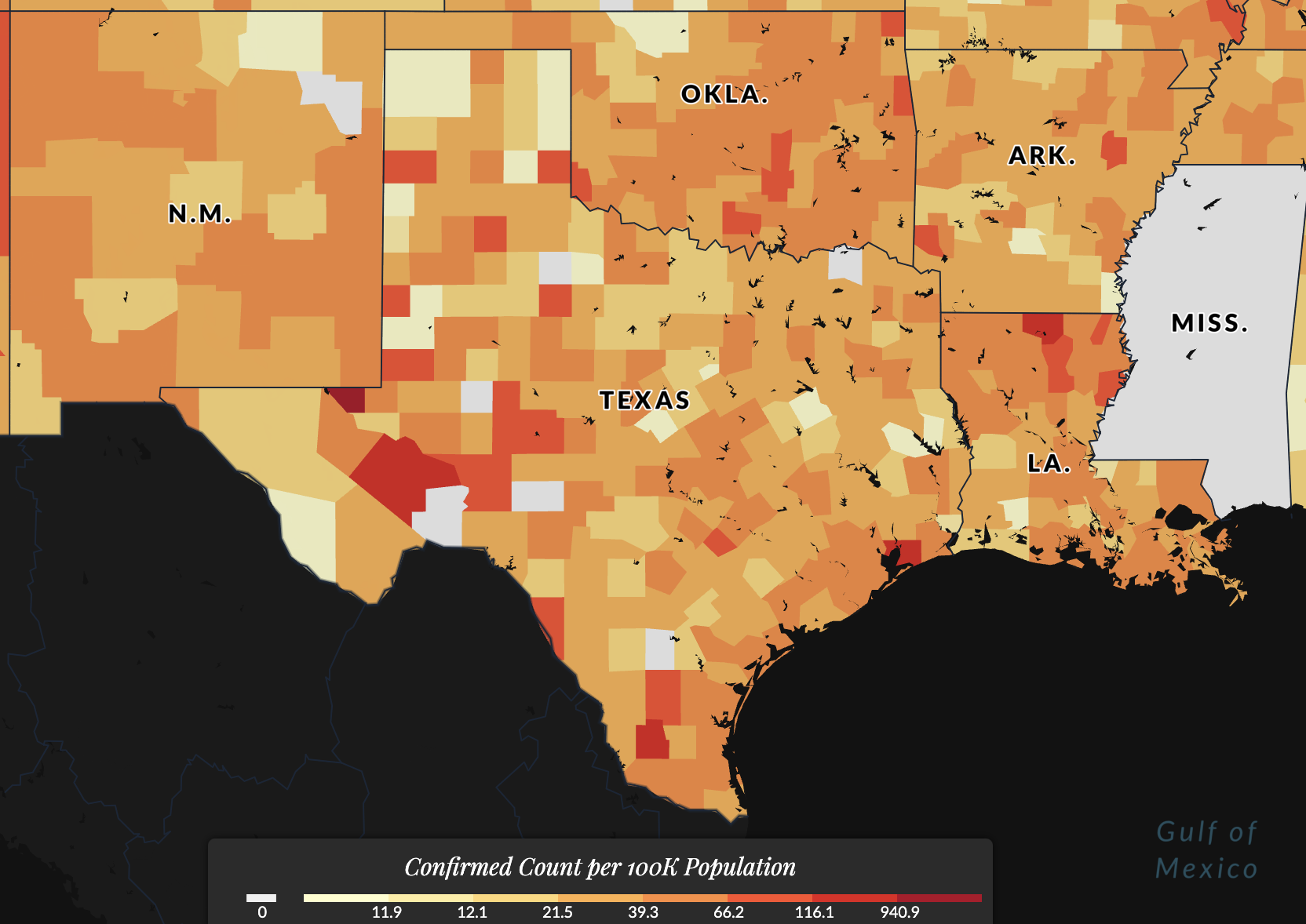
Natural Breaks Map
Selecting Natural Breaks, also known as Jenks, will plot data from the selected variable according to a non-linear algorithm that categorizes observations into similar values, grouping and highlighting extreme observations.
It's like a clustering algorithm for the data, searching for optimal break points in the data. Learn more about how the Jenks break works.
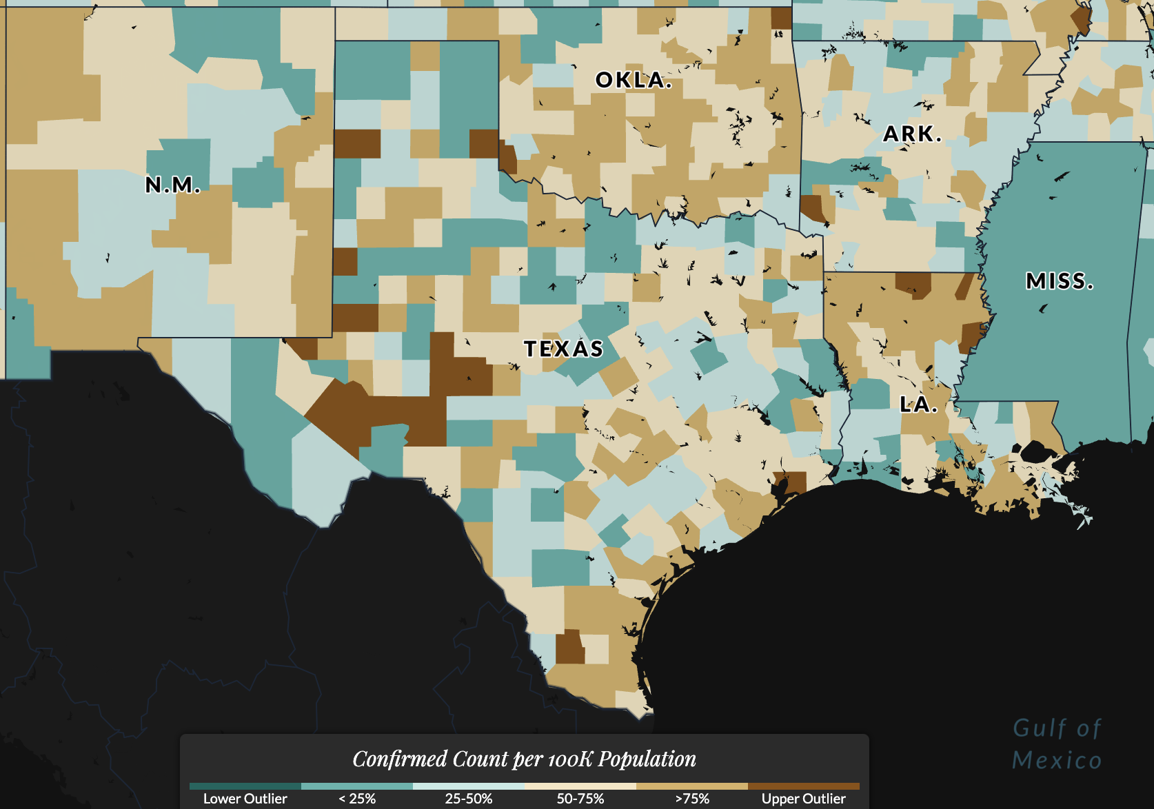
Box Map
Selecting Box Map will plot the selected variable by categorizing data into bins according to where it would lie on a box plot chart (25th, 50th, 75th percentile, etc.) This is useful for identifying outlier data -- data that is significantly different from the rest, i.e. counties with much higher or lower rates compared to all other counties.
This is the mapped version of a traditional box plot.
Alternate methods of determining data classification breaks for thematic maps include quantile, percentile, equal interval, or developing customized breaks for the data. While these are all useful approaches, they may not be optimal for all data.
Read more about choropleth thematic maps at the GIS&T Book of Knowledge.
The US Covid Atlas uses standards of exploratory spatial data analysis to guide these decisions. If you'd like to explore more options, consider downloading the data and developing more maps yourself using free statistical software like GeoDa and a basic mapping tutorial.