Identifying Trends Over Time
Line Chart
LOCATION: TOP RIGHT, MOVEABLE
The Atlas’ Line Chart allows you to look at the nation’s or a particular county’s historic data now relative to trends in the past.
The Line Chart pops up in the top right corner when you first navigate to the Atlas. It can also be accessed by clicking the Line Chart button on the left-hand side Map Navigation Panel.
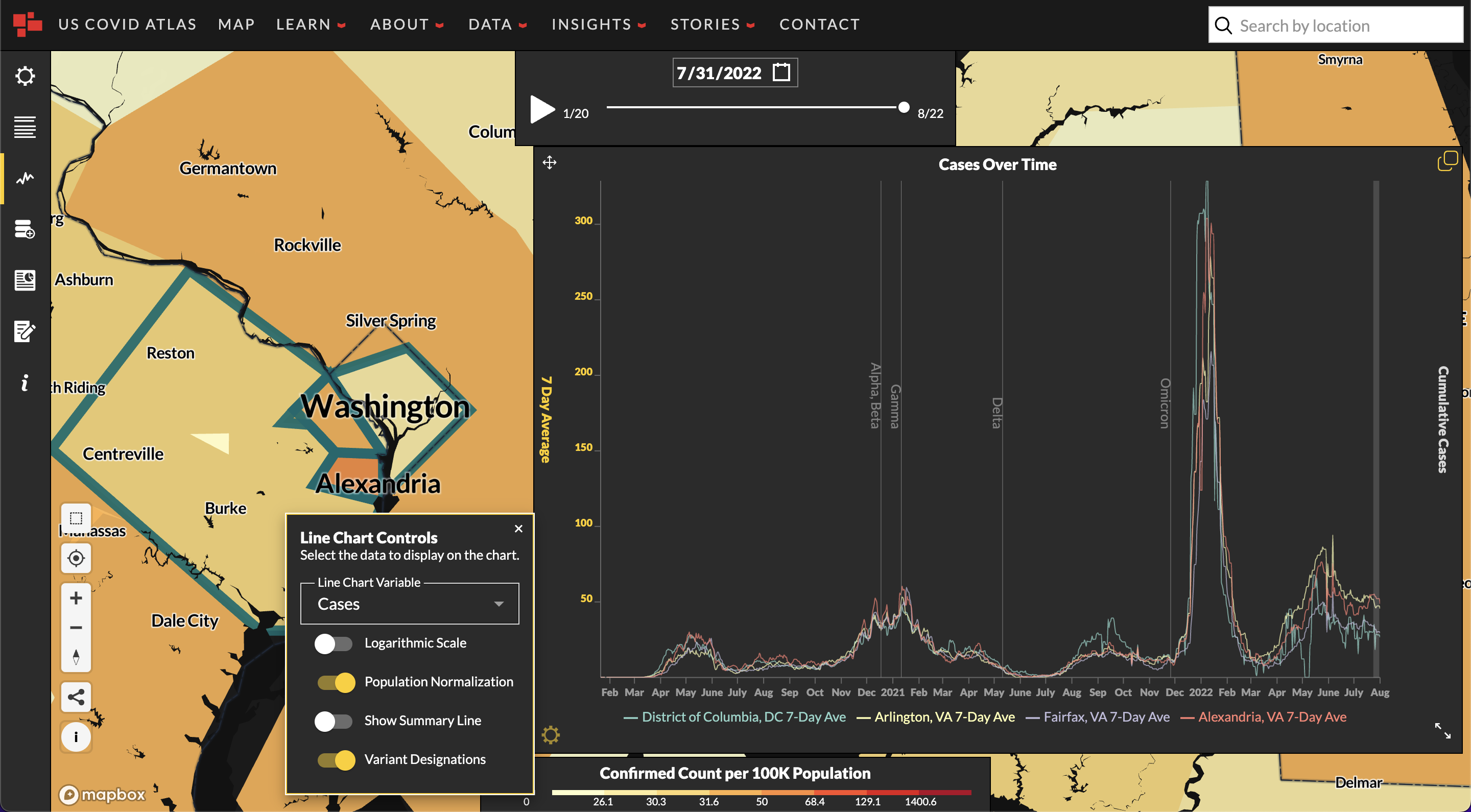
Using the arrows icon in the bottom right hand corner , expand the Line Chart window for a better view of the data. Click on a county to visualize county-specific COVID trends or leave counties unselected for a national overview of historical case data.
- The white line represents the average of new COVID cases each week, the 7-day average.
- The yellow line is the cumulative or total number of cases that the county has experienced since the beginning of the pandemic.
- In the bottom left hand corner, you’ll see the Gear icon indicating the Line Chart Controls menu.
There, you can choose from a number of options to visualize in the Line Chart: - Line Chart Variable: Choose from cases, deaths, or fully vaccinated persons.
- Other Line Chart Controls: Toggle between options to visualize data in different ways. Toggle On or Off:
-
Logarithmic Scale: If selected, the y-axis will scale logarithmically. Otherwise, it will be linear
-
Population Normalization (Rates Per 100K)
-
Show Summary Line: The summary time-series data for selected counties
-
Variant Designation: Approximate dates of when different identified COVID-19 variants started being tracked by the CDC.
-