Hotspot Maps
Location: Data Sources & Map Variables
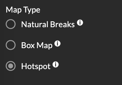
The Atlas allows you to identify hotspots and cool spots to visualize 'interesting locations' and trends related to COVID-19. To find and examine hotspots, select the spatial scale of your variable of interest, use the map variables panel (left sidebar) to select the data source and variable that you would like to map. Under Map Type, click on the Hotspot button and use the color ramp at the bottom of the screen to see if a region falls into a hotspot category.
METHODS:
The Atlas identifies hotspots using a spatial cluster detection method called LISA or local spatial autocorrelation. What this means is red shaded clusters (high-high or high-low) represent hotspots or areas with high rates; while blue shaded clusters (low-low or low-high) show cool spots, or areas with low rates. To learn more about local spatial autocorrelation, click here.
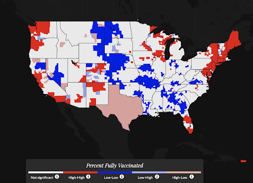
Although it may be to associate hotspots in red as ‘bad’ and coldspots in blue as ‘good’ – especially for case rates – it’s important to remember that, when exploring vaccination rates, the opposite is true! Hotspots in red signify regions with high vaccination rates and coldspots in blue identify regions with low vaccination rates.