FAQs
FREQUENTLY ASKED QUESTIONS, AND THEIR ANSWERS.
These questions were posed to the U.S. Covid Atlas team over the duration of the Pandemic. We retain them for archival purposes, and add context.
How was the Atlas used during the Covid-19 Pandemic?
The Atlas was used in multiple ways. Below we higlight five core usage scenarios common in earlier stages of the Pandemic, as they were shared on the orginal home page. Check out addditional insights from the Atlas team, learn how to explore the Pandemic historically, and/or read about more ways that the Atlas was used in our evaluation report (coming soon!)
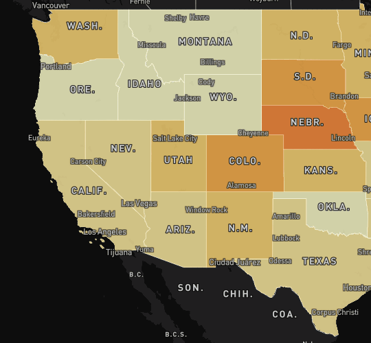
Identifying Regional Hotspots for Mitigation
Users could generate spatial statistics to detect hot spots with raw case data or by adjusting for population. Because of the infectious nature of COVID, high numbers of cases anywhere would be of concern. At the same time, identifying areas that had a disproportionately higher number of cases within the population was necessary to locate areas hit hardest by the Pandemic.
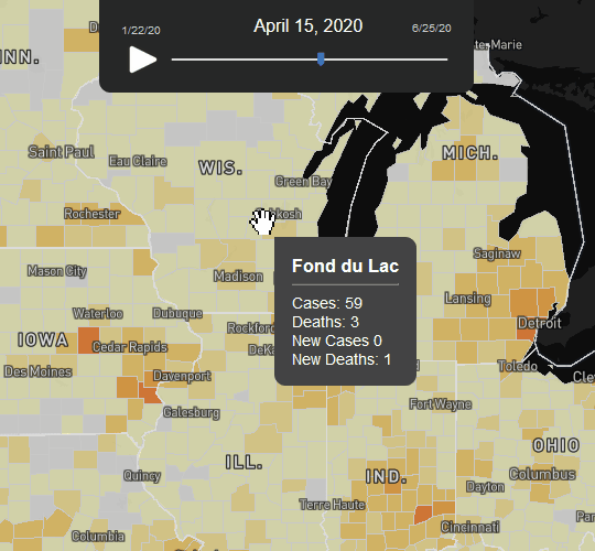
Tracking patterns to better plan ahead
Users could visualize change over time to better understand the distribution and spread of COVID in the US throughout the Pandemic. Moving the time slider or clicking the play button enabled the user to watch the spread of COVID. Analyzing patterns of the spread was essential to support planning for resource allocation.
Forecasting viral spread at state and county levels
Switching between the state and county thematic maps helped zero in on COVID clusters at a local level. Then, selecting and tracking hotspots over time using the Local Moran's I statistic helped confirm and explore areas of concern. The Atlas served as a powerful visual analytic tool to find COVID spillovers along state borders, emerging from one county to areas nearby, and more.
Making visible vulnerable communities
Users could click on counties to get more information about community health factors and socioeconomic indicators like average length of life in an area, percent uninsured, or income inequality metrics. In the main selection panel, overlaying segregated cities or Native American Reservation boundaries could help identify uniquely vulnerable locales.
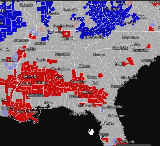
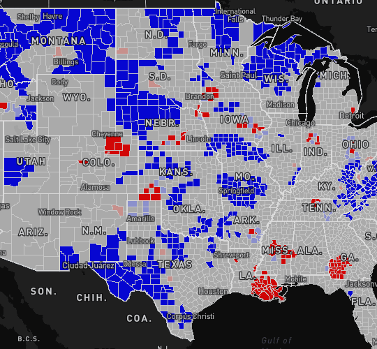
Identifying emerging risk
The Atlas enabled exploring how hotspots progressed or diminished over time, and also helped identify areas of emerging risk early. Some hotspots began as spatial outliers -- shown as pink in the map, meaning cases were high in that county but low in neighboring counties. If cases continued to grow and spillover nearby counties, the areas would turn red. Mature hotspots were defined as clusters of counties that remained red over time, and continued to grow.
Why are there multiple data sources for COVID case and death rates?
The impact of COVID-19 reaches far beyond a single data metric. The Atlas makes multiple COVID and community context variables available in order to paint a more complete picture of the ways in which the Pandemic has affected different communities in different ways.
For variables like COVID cases and death rates, we provide multiple data sources in order to allow users to compare and contrast reported data. This was particularly important earlier in the Pandemic. For most of the first year, there had been no single, authoritative source of COVID case data in the United States. When we launched the Atlas in mid-March, we incorporated data from 1Point3Acres, a crowdsourced dataset from international volunteers that offered the first available county-level data for public use, as well as USAFacts, a journalistic dataset making county-level data available early on. As the Atlas has expanded and evolved alongside national data collection and reporting efforts, we also incorporated county-level reports from The New York Times. We sourced COVID vaccination rates and testing data directly from the CDC.
Our research has further demonstrated the importance of reviewing multiple COVID-19 data metrics.
Why the focus on county-level data?
County-level visualizations show a dramatically more detailed pandemic landscape, while state-level or national aggregate data may obscure local hotspots of surging cases. By focusing on state-wide or even national metrics, it’s easy to miss rapidly surging cases locally and spillover across state boundaries. County-level data (and finer resolution, when available) is critical for targeting efforts, whether isolating virus spread or identifying a disproportionately hit area for recovery priority.
The US Covid Atlas was the first dashboard to visualize data at both state and county-scale as total cases, deaths, and population-weighted rates to provide a richer understanding of the pandemic.
Could users track vaccination rates in their state or region during the Pandemic?
Yes. The Atlas featured three vaccination metrics, sourced from the CDC:First Dose Administered, Second Dose Administered, and Doses to be Distributed.
The Doses to be Distributed variable is taken from the total doses distributed subtracted by the total doses administered. This gives an estimation of the number of doses "on hand" for each state. See our detailed data descriptions for more information.
How can I explore trends in vulnerable populations?
COVID disproportionately impacted communities of color and low-income communities across the country, exacerbating already-existing disparities. To draw attention to these disparities and help with efforts to track and implement an equitable recovery, there are several ways to highlight vulnerable populations using the Atlas.
Through selecting an Overlay option, you can explore data and trends in hypersegregated cities (and their metropolitan areas), Native American Tribal Reservations, and Southern Black Belt counties. Use these overlay features to examine at trends in a single area (for example, selecting Hypersegregated Cities and zooming in on Chicago), region (viewing multiple metropolitan area counties in the Midwest) or nationally (exploring trends across all hypersegregated cities). You can also visualize and map several of these community health factors, including Uninsured Percent, Over 65 Years Percent, Life Expectancy, and Percent Essential Workers.
You can also easily access more than a dozen community health indicators for every county. Sourced from County Health Rankings, this data includes metrics on median income, childhood poverty, unemployment rates, uninsured rates, racial segregation, drug overdose deaths, and more. Click on a county (or multiple counties with ctrl click), then the Report button on the right side of the map. Scroll down for the full data report.
Read more about mapping community context in the learn toolkit.
What do mobility metrics show?
Three mobility metrics were added to the Atlas: Percent Home on Workdays, Percent Full Time on Workdays, and Percent Part Time on Workdays. These metrics reflect the percent of devices observed as completely at home, at a workplace for 6-8 hours (full time), or at a workplace for 3-6 hours (part time) for each day included. They are sourced from Safegraph’s Social Distancing Metrics.
We also added an Essential Workers data layer to contextualize these mobility metrics. This variable (found under Variables > Community Health Information) estimates the percentage of adult workers in essential occupations, based on 2019 American Community Survey county-level estimates.
More about Safegraph’s mobility data: Safegraph provides U.S. Census block group level data that reports mobile phone device activity reported from apps that collect location data, which we then aggregate up to the county and state level for Atlas mapping. Safegraph data is generated from a series of location pings throughout the day, which determine various behaviors, such as staying completely home, full time work, part time work, and delivery (multiple, short visits). See our detailed data descriptions for more information.
Can you explain the Map Type options? What’s the difference between natural breaks, box maps, and hotspot maps?
We provide multiple Map Type options to facilitate different views for exploratory analysis. Different maps emphasize different aspects of the data, and can help reveal and communicate data insights in different ways. You can select and view data as any or all of the following Map Types, and then dive deeper by comparing different Visualization Types (2D, 3D, or Cartogram) for each map.
Natural Breaks maps use color to show the count or percentage of a variable. The Atlas uses color to show the counts and percentages of COVID cases, deaths, testing, vaccinations, mobility, and community health contextual factors.
Box maps are useful for detecting outliers and gaining an overview of the spread of the data distribution. Box maps group values (i.e. COVID case counts or rates) into six fixed categories: Four quartiles (1-25%, 25-50%, 50-75%, and 75-100%) plus two outlier categories at the low and high end of the distribution.
Hotspot maps show local clusters of areas where neighbors share a particular quality, such as high rates or numbers of confirmed COVID cases. A hotspot is an area (on the Atlas, an area is a state or county) that is significantly different from the areas surrounding it. On these maps, a hotspot may be one area, or a cluster of areas.
Read more about mapping styles on the Methodology page.
During the Pandemic, were users concerned about hotspot areas other than "High-High" clusters?
The Atlas shows four types of hotspot areas. High-High areas are significant because they indicate areas with high numbers or rates that are surrounded by neighbors also with high numbers, compared to the rest of the country. However, each of the four types represents a statistically significant trend:
- High-High: Areas with high numbers whose neighbors also have high numbers or rates. Bright red counties have a significantly high number of cases or deaths, or significantly fewer hospital beds per case. Neighbors for these areas also have high numbers.
- Low-Low: Areas with low numbers whose neighbors also have low numbers or rates. Bright blue counties have significantly fewer cases or deaths, or significantly more hospital beds per case. Neighbors for these areas also have a low number of cases.
- High-Low: Areas with high numbers whose neighbors have low numbers or rates. This type of hot spot is also called an outlier, because it differs so much from its neighbors. Pale red counties have more cases, deaths, or fewer hospital beds per case than do their immediate neighbors. The surrounding areas may experience significant spread of the virus in future weeks.
- Low-High: Areas with low numbers whose neighbors have high numbers or rates. This type of hot spot is also called an outlier, because it differs so much from its neighbors. Pale blue counties have fewer cases, deaths, or more hospital beds per case than do their immediate neighbors. These areas may experience significant spread of the virus from surrounding areas in future weeks.
Read more about Hot Spot statistics on the Methodology page.
Can I load my own data and view it in the Atlas?
Yes, this feature was added to the Atlas. See the tutorial on Adding Custom Data. You can also generate a Custom Report for your community.
When will you add COVID case data by race, age, and demographics?
As of 2024, COVID data is still not available by race, age, and demographics in a single data source for all counties across the United States.
During the Pandemic, we recommended several projects that compiled state-wide COVID race and ethnicity data while also advocating for greater county-level data reporting, including the COVID Racial Data Dashboard and Data 4 Black Lives. Check out a workshop we hosted with keynote Jamelle Watson-Daniels who spoke on these challenges for more details (via Youtube).
Where can I learn more about insights that the Atlas is generating?
Check out Atlas Insights for published research, briefs, and access to the US Covid Atlas Blog. The Blog includes multiple updates from the research coalition, workshop highlights, and past updates over the course of the Pandemic.